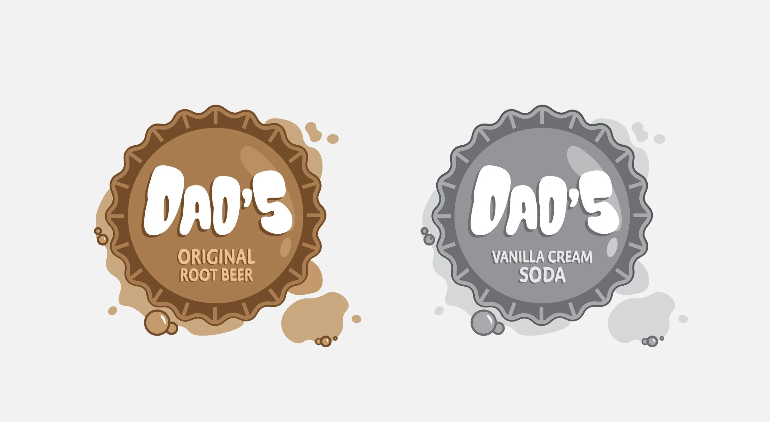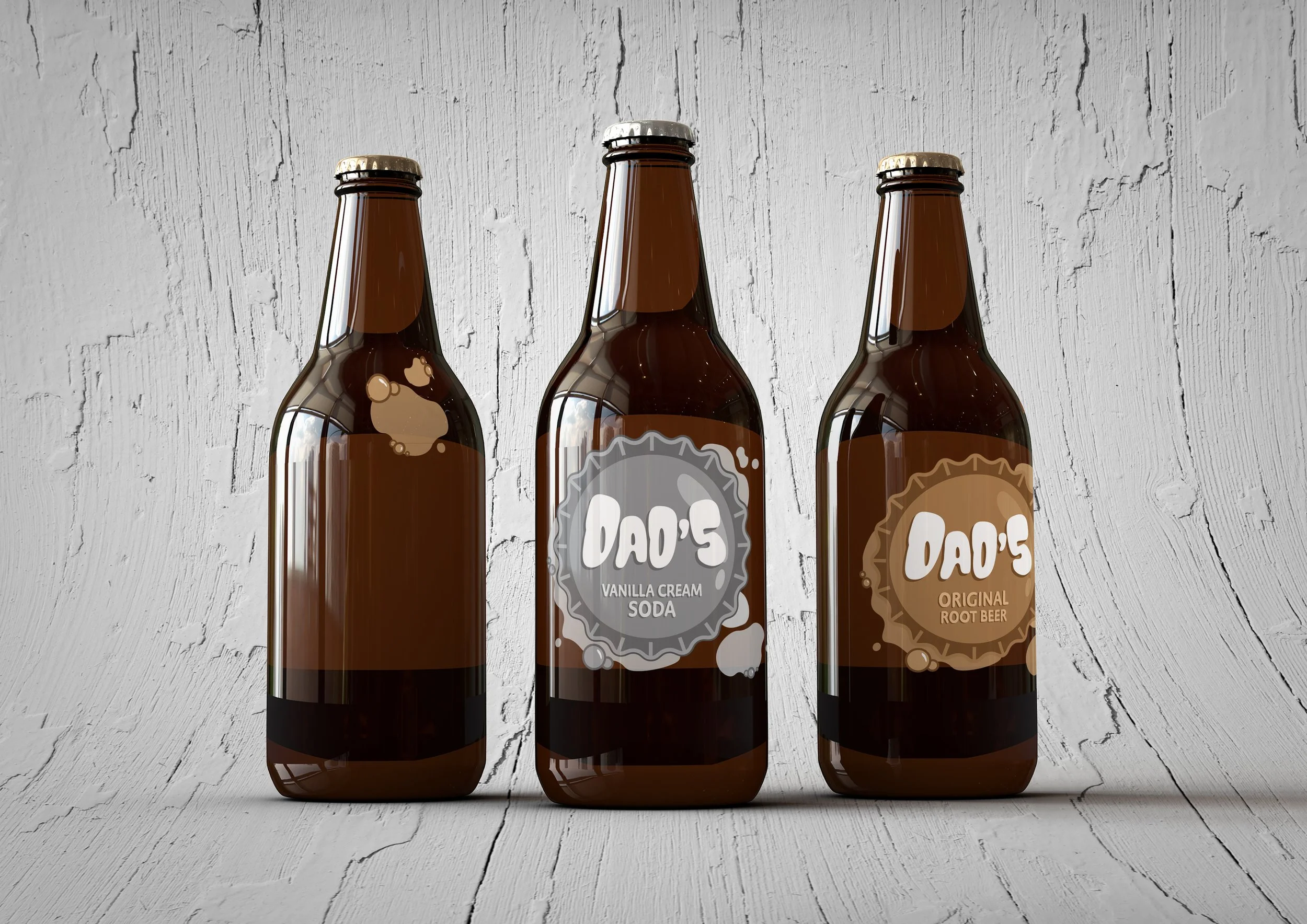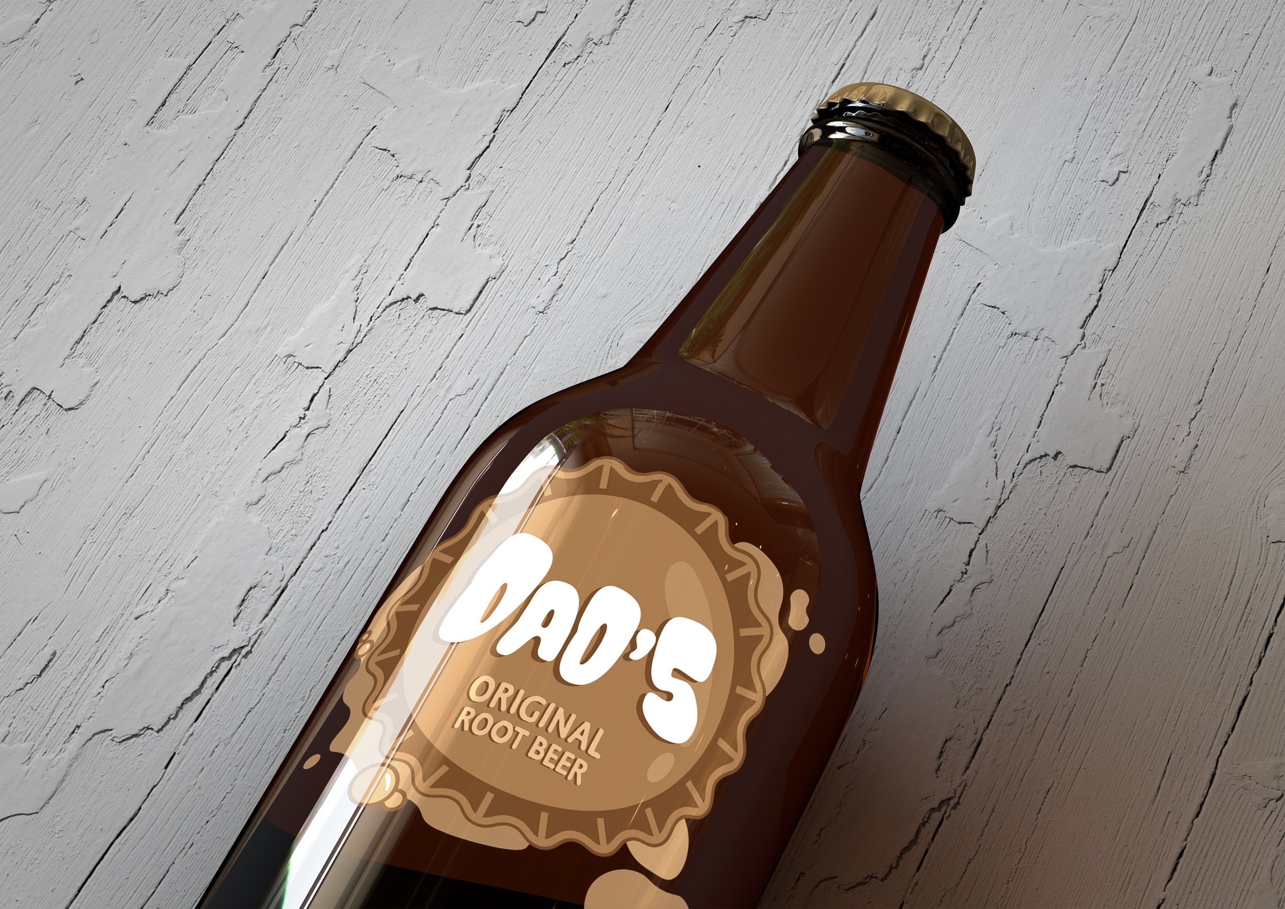
DAD’S ROOTBEER
REBRAND: LOGO AND PACKAGING

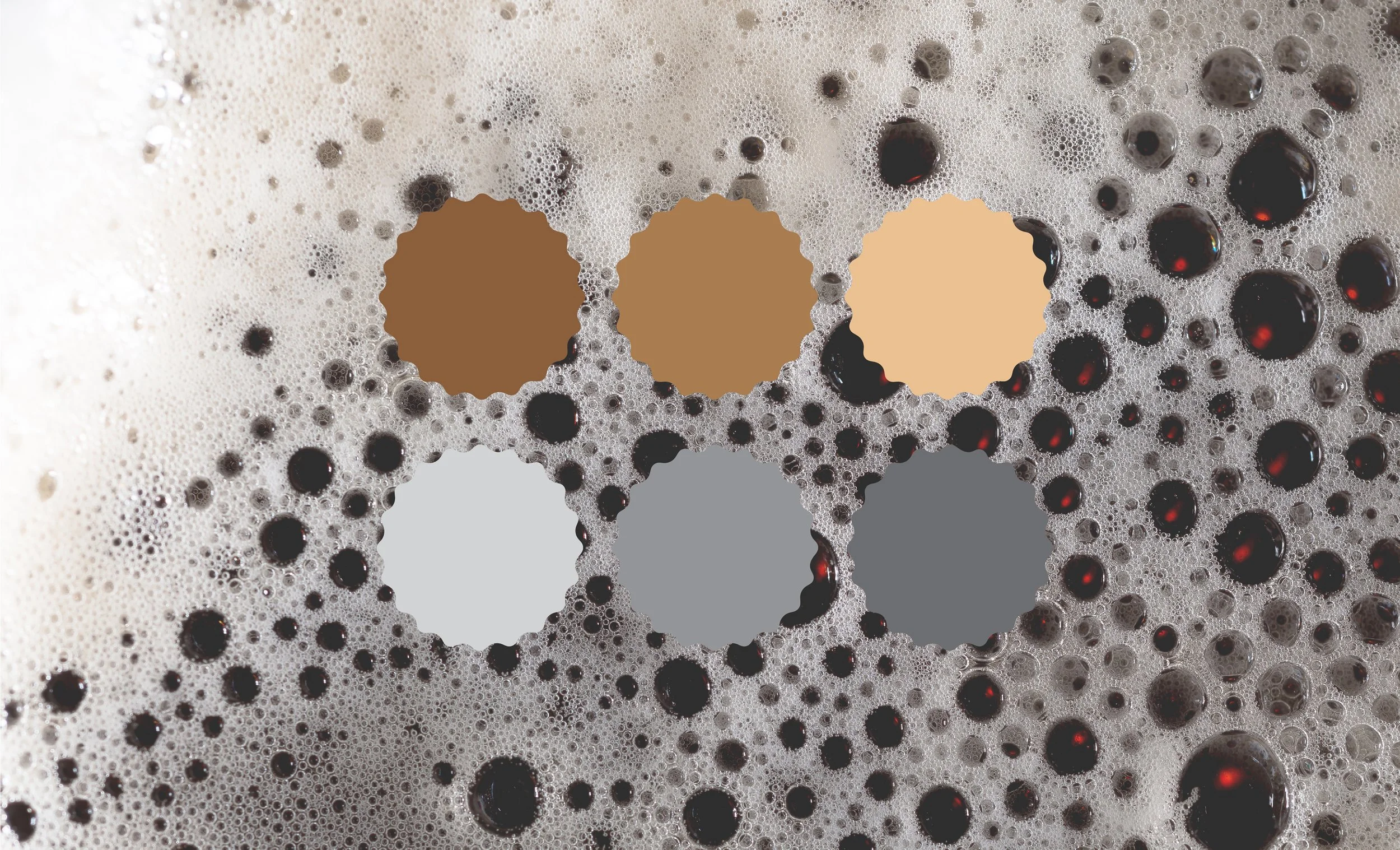
This rebrand of Dad’s Old Fashioned Root Beer is a fun twist on a classic soda brand. The logo is meant to mimic the foam and bubbles that naturally occur in root beer itself, paired with a bold, rounded font to compliment the bubble shapes. I wanted the color of the logos to change in order to reflect the flavor inside the bottle. This logo and rebrand is meant to be lighthearted and have a more modern aesthetic to appeal to a wider range of consumers.